Wednesday, March 17, 2010

IUI 09 - Do You Know?

Do You Know is a friend recommendation widget developed by the authors for use in IBM's internal social networking system. The authors developed DYK with a novel UI which they proposed would help make accurate and welcome connections. One of the major features of DYK is the extensive list of reasons why the person was recommended. They interviewed users after the testing period and one user response stuck out to me. They thought it should be more clear about what happens if you click 'No Thank You'. They might not click 'No' for someone if that person would be notified.

Thoughts
I think recommendation systems further separate our social worlds. There is already a sense of real life friends vs online friends. I think that is should be real life connections that start friendships. If you have enough in common with someone that they are recommended by software then you probably already know them and if you are not online friends already then theres probably a good reason.

Tuesday, March 16, 2010

CHI 09- Lightweight Tagging

The paper explores the use of tagging in the setting of a personal computer. Using tagging to support new ways of working with and accessing applications and documents. They created an application which runs within Windows that supports the generic tagging of applications and documents. They collected data across a group of users who used the system on their work computers to help with their jobs. They found that the tags were particularly useful when working with information from diverse data stores and that users were able to create new types of data organizations which bridge folder systems and document types.

Thoughts
The idea of being able to tag items in my work computer seems useful. Maybe this same concept could be used in a IDE to tag files or specific methods. Then you could easily pull up a small specific working set of code.

CHI 09- EyeSpy

The authors created a game to encourage the creation of an accurate landmark image database.
The game consisted of taking pictures of landmarks and accurately describing them. For each player that went to and confirmed your picture of the landmark you received points. You would also receive points for locating and verifying the pictures other players had taken. The goal was create a large database of accurately described and photographed landmarks which would be used in a navigation application.

Thoughts
The game doesn't seem all that fun to me. It would be better if the descriptions were riddles or something but that wouldn't work at all.

Monday, March 15, 2010

CHI 09- Dynamically Changeable Buttons

Chris Harrison, Scott E. Hudson - Carnegie Mellon University, Pittsburgh, PA, USA

The authors attempt to combine the low-attention and vision-free interactions possible with physical buttons with the flexibility of a touchscreen display. They create an interface layer that consists of a deformable surface on top of a display screen. For their user study they measured the amount of glances required to make a button touch using four different interfaces, a flat surface, physical buttons, their system with the button sticking out, and sunken in. The results showed that their system in both configurations required less glances than the physical buttons or a flat surface.

Thoughts
Physical buttons are irreplaceable in my opinion. I can't imagine ever giving up my plastic button keyboard for touch pad version. I liken their system to the buttons on some cheap remote controls, a sheet of plastic with bumps for buttons. The problem was never finding the buttons but getting it to register clicks. Anyway, the methods of created physical buttons on top of a display is a great idea however it will never be widely used if it uses a projector and camera to sense input because the setup is just too large.

CHI 09- Remembrance of things tagged

Raluca Budiu - Nielsen Norman Group, Fremont, CA, USA
Peter Pirolli, Lichange Hong - Palo Alto Research Center, Palo Alto, CA, USA

This paper sought to find the effects of tagging system on tag production and information retention. They compared two different tagging systems, one you simply had to select a word or set of words and then click Ok and the other required the user to type the tags into a text field. Using these 2 systems and the base case of no tagging system the authors wanted to see how each system affected the amount of tags created, the users' reading speed, fact recall and recognition. The results showed that tagging did not significantly increase recall or recognition.

Thoughts
It is interesting to see a study about how tagging methods and tagging in general affect our ability to read and remember information. I thought for sure that tagging would significantly increase the recall and recognition rates and that type-to-tag would do so more than click-to-tag. Maybe since tags reduces information to only its keywords we somehow forget it easier.

Sunday, March 14, 2010

CHI 09- Butler Lies

Jeff Hancock, Jeremy Birnholtz, Natalya Bazarova, Jamie Guillory, Josh Perlin, Barrett Amos
Department of Communication and Information Science Program
Cornell University
Ithaca, NY 14853

The authors introduce "butler lies" which they define as an act deception to manage social interactions. Butler lies are used to avoid and exit conversations, and to explain communication behavior. Examples would be like saying, IMing "cant talk, im studying" when you are not studying, just don't want to talk to that person. Or maybe telling someone "sorry I missed your call I was in the shower" when really you just didn't want to talk to them then. These lies are rampant in our society because of our many forms of 'always-on' communication such as cell phones, text messaging and email.

Thoughts
I think its awesome that someones finally coined a term to cover these little lies. 'Butler lie' has a fitting connotation in my opinion like 'respectful, nothing-personal, lie'. It is just like if someone came to your house and knocked, and you told your butler to tell them you weren't home. In fact that's probably why they chose butler lie. I think that the definition of a butler lie should also include deception to start a new conversation, such as, 'oh sorry my phone must have called you on accident, but anyway whats up?' or sending a 'i had a great time last night' text message to ex girlfriend by accident just to make her jealous.

CHI 09- Social TV

David Geerts and Dirk De Grooff IBBT / K.U.Leuven, Leuven, Belgium

Social television enables remote communication and interaction between viewers. Many social TV systems are currently in development. There are existing guidelines for ensuring a usable system however there are no guidelines evaluating the social aspects of a system. The authors propose a set of twelve heuristics for measuring the sociability of these TV applications.

Their heuristics in my own words:
  1. Offer text and voice communication.
  2. Have a user status bar with options like busy, away, watching intently, watching relaxed, and not really watching at all just sitting on the couch with the TV on.
  3. Let people collaborate at the while watching at the same time or if they watch at different times.
  4. Allow for interactions between people at different TV and also people watching at the same TV.
  5. Track and use everyone's TV choices and habits
  6. Let the user change the settings.
  7. Have privacy options and ensure privacy.
  8. Don't distract from the actual TV watching.
  9. Be sure and tell user about changes and upcoming shows or events.
  10. Recognize the genres of programs and behave appropriately for each genre. Like don't allow for people to spoil the endings of mystery shows but for comedy shows it doesn't really matter.
  11. Allow for sharing between devices like a PC or smartphone.
  12. Encourage shared activities.
The major effort of the authors was spent on grounding these sociability heuristics in observed user behavior. They have not validated these heuristics yet because no social TV systems are commercially available.

Thoughts
The heuristics they propose seem like 'duh' to me. I am assuming that these authors are attempting to create a social TV system and one of their first steps to research the design requirements. After they gathered the requirements they thought 'Hey we could publish a paper about these' and that's just what they did. All the heuristics are good ideas in my opinion and I agree that a system that fulfilled them all would be a success.


Tuesday, March 2, 2010

Emotional Design

Don Norman is back and he's learned a few things. Some time since his last book he must have visited the home of a few real American families and noticed that people gladly purchase and enjoy items that are ugly, impractical, and not well designed. This book is his attempt to reconcile human preference with good design.

He identifies three aspects of emotional design visceral, behavioral, and reflective. I think that reflective should really be split into two sections: Reflective - self-image, how others view you with the object, associated social stigma. Personal or Internal - personal or spiritual satisfaction and memories. As he has it, reflective design is out of proportion compared to the other two aspects.

I do agree with his concept of emotional design. Personally I make all my decisions based on emotion. Things are always more enjoyable when chosen for their emotional quality. Forget practicality, do what feels best.

Tuesday, February 16, 2010

Asylum Run by Inmates

Alan Cooper

From the first chapter this book already seems to be overlapping a lot with the things Don Norman was saying from the last book. One concept that I really enjoyed was the apologists and survivors. It's nice that he acknowledges that there are more than one few point on design. I do not think that these names are great, they sound weak but I have yet to think of something better. The survivor and apologist outlooks are true for all life not just design. Its Republican and Democrat, right and left. The apologists are of course the right wing, 'the software does what it needs to do,if you dont like it, dont use it', 'this is the way its always worked and we've been fine', 'it wouldnt be so hard to use if you didnt drop out of highschool you bum', 'this is america where we speak english'. And the survivors are the left-wing Democrats who feel entitled to be able to understand and use the software, socialized tech support, software should cost more and be easier to use. Its the age old battle of liberty versus equality. Apologists want the liberty and freedom to use the software how they want and if some can use it better than other then good for them. Survivors think software should be equally usable by everyone.

This raises a question, if everything was perfectly designed, what kind of world would we live in? Id think itd be a world of artists. With everything designed perfectly there would be no need for alot of occupations. It would be a world of artists and the only thing ever in question would be aesthetics.

But will design ever be perfect, I dont think so. Design is inherently an iterative process. No design will ever reach perfection, it will either be made obsolete or altered, changed, or built upon as the needs and requires of society change. And even though I believe it to be iterative no one wants it to be. No one wants things to change, and so these iterations take decades or even centuries. Who knows when we will see a new take on pants really catch on. Pants have been around for over a 100 years I'd say but certainly they can't be the perfection of leg attire for men. We'll have to wait and see. Maybe pants made of fabric that can shrink and expand. Say when you are jogging the pants tighten on your legs like spandex for better running and breath-ability but when you slow down to walk they expand to normal pant size, and then if you sit down then expand further like a comfy blanket over your legs.
Tuesday, February 9, 2010

CHI 09- IKEA Hacking


Daniela Rosner, Jonathan Bean. University of California, Berkeley

http://ikeahacker.blogspot.com/

Summary
This paper is a look into the growing trend of DYI and home hacking. Specifically they focus on IKEA hacking. If you dont know, IKEA is a Sweedish company that makes all manner of home products. They sell furniture to ice cube trays, small-space storage solutions to complete kitchen remodels. Their products usually lean more towards a Danish Modern look however they do have products more Contemporary American. The researchers interviewed nine frequent IKEA hackers to gain insight into the creative and collaborative community. One hacker defined the community as "a collaborative set of non-concurrent projects". The paper provides enthnological data on these emerging online communities and suggests that there is a need to develop new ways of online collaboration.

Thoughts
I am a big DIY-er and a fan of IKEA. Most of their stuff isnt the best quality but you just have to consider that its all 2-3 year items. Meaning youll have them for that long and then chunk them and thats ok because they were cheap. I am familiar with IKEA hacking and it is a consistent topic in all the home-centered blogs I read.

I thought it was silly for them to draw conclusions on the effects online culture simply based on the fact that the word 'hack' and 'program' have now entered common vocabulary and have gathered new meanings.

Overall I think that the traditional website has become a bit outdated and we should work on new ways of online collaboration. Maybe like an interactive Flash site which is like an in browser Second Life kind of thing. Or maybe like an online shared cork board of ideas and posts and links and images. Or maybe some sort of online version of a shared Lego table, like the one that is the doctors office or in the back of a car dealership. Were kids can come and make something but then they have to go and the next kid comes and either adds on to what is there or destroys it. Something like that but for adults.

Thursday, February 4, 2010

CHI 09- Steerable Focus


National Taiwan University

Summary
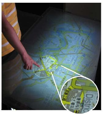
The paper was focused on a mixed resolution table projection display. The display was capable of displaying a large area in low resolution and a small area in high resolution. They built an application which uses Google Maps to display a large map in low res with a small focus area in high res. They tested two methods of moving the focus section. One was with the focus section being fixed in one location and the map would move under it. And the other the map would remain still and the user could direct the focus section, steerable. They tested each method on two tasks and found that users were able to complete the tasks faster with the steerable focus.

Thoughts
The results of the study showed what I thought. In my experiences playing computer games or using software I knew that the steerable focus would be superior. This seems to fit inline with things Don Norman was talking about, mental models, and analogous actions. Being able to steer the focus section is much like using a magnifying glass. The study proves that the action being a reality based interaction is better than the one that is not.

Tuesday, February 2, 2010

Design of Everyday Things

Summary
There are a lot of great concepts in this book. It was impressive how many concepts that we have been seeing in the UIST papers and also in my own research were covered. Things like natural mappings, analogous actions, and mental models. Many of these ideas are things I've been researching for my senior capstone projects. The project will be exploring new multitouch gestures and we are currently in the design stage. I recently read a paper concerning alot of these same things and they referred to natural mapping, mental models, etc. as a group named "reality-based interactions". I have also been thinking about designing visibility in a different way than what he talked about, external visibility. External visibility considers the ability of others not involved to follow along with what the author is doing.

Thoughts
This book made me rethink everything about everything. Having read the book I now see errors all around me. He provoked a lot of new ideas about doors and phones. Being written over twenty years ago some parts were very funny. For example when he was talking about the small computer in his pocket that could keep track of his planner and his address book, then he said, "...and it would need to have someway to connect to a phone."

Questions
How will his ideas change on knowledge in the world vs knowledge in the head?

Are his seven steps on an action applicable to software?

Sunday, January 31, 2010

Ethnography Idea

I'd like to do something having to do with YouTube. Maybe looking at rating, view count, comment count amount, Im not sure yet.

Tuesday, January 26, 2010

UIST 09- Collabio

Summary
Collabio is a game for Facebook that incorporates creating social tags for people. The idea of tagging is for a user community to create tags that describe information. Social tagging is creating tags that describe a person such as their interests, affiliations, hobbies, and personality. In order to encourage tag creation they incorporated the tagging into a game. They also hypothesized that the social implications would deter people from posting inaccurate and offensive tags. In their study they let the game run live as a Facebook app and logged all the interactions. In their study they found that users of the system had an average of 9 tags for themselves and no incorrect tags were created.

Thoughts
Tagging is a useful thing but I think it is silly to put tags on a Facebook page. Someone Facebook page is already tagged many different ways by the user themselves, isn't that the purpose of the site. Using a game to accomplish the goal was a good idea and proved once again that games can serve a useful purpose.

Monday, January 25, 2010

UIST 09- Ripples

Daniel Wigdor, Sarah Williams, Michael Cronin, Robert Levy, Katie White, Maxim Mazeev, Hrvoje Benko
Microsoft Surface | Microsoft Corp. | Microsoft Research

Summary
This research is aimed at solving a tricky issue when it comes to multitouch and touchscreen devices. The issue is that touch screens lack in the inherent tangible, audio, and visual feedback of a traditional mouse. When using a mouse you know that a click has been made because of the clicking sound and the depression of the button. You also always know exactly where on the screen the mouse is because of the cursor. On a touchscreen however you do not get these forms of feedback. This creates ambiguity and can lead to user frustration. To address this issue they have created a visualization technique for providing feedback about finger location and pressure. The simple rippling and tailing effects remove the ambiguity of the screen and create a less frustrating environment.

Thoughts
I am curious as to why they did not include a sound component. I think that the clicking noise of a button or key is a significant feedback element. Why did they choose to leave it out? Also in respect to future work, I wonder how they will choose to address the issue if mouse-in and mouse-out.

Thursday, January 21, 2010

UIST 09- Tounge Gestures

T. Scott Saponas, Daniel Kelly, and Babak A. Parviz (University of Washington, Seattle) and Desney S. Tan (Microsoft Research)
Summary
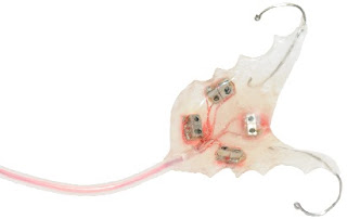
This paper is aimed at exploring new ways of interaction for those with severe physical handicaps. In most cases of gross motor loss the ability to control eyes, jaw and tongue often are unaffected. Much work has been done exploring eye tracking and speech recognition; this paper attempts to explore the untouched area of tongue input. Prior work on tongue sensing have used things like a mini joystick in your mouth that can be controlled with the tongue or pressure sensitive buttons on a dental retainer. This paper asserts that these devices treat the tongue only like a finger when in fact the tongue is a complex muscle able often used to perform feats of dexterity like swallowing or generating speech. The device they created is an optical tongue sensing retainer (pictured above). Their optical approach allows for tongue gesture recognition. In their experiment they used four gestures, left swipe, right swipe, tap on the palette, hold on the palette. The qualitative results of the experiment exposed some interesting tongue-unique problems. Gesturing with the tongue causes it to deform and change shape. The set of tongue gestures they implemented could be performed in multiple ways ie. a swipe against your front teeth or a swipe in the back of your mouth. Also the varying difference in mouth and tongue shape across participants required a large amount of custom configuring and calibration.

Thoughts
Although I was not aware about tongue sensing technologies, after hearing about the approaches of prior work I was intrigued by this paper's view of the tongue as a unique modality instead of as a finger. I was disappointed however by the non innovative gestures. Swipes, taps and holds seem to me to be finger-centric designs. After they defined the tongue as a unique non-finger-like control I was hoping for some more innovative tongue gestures. I'm not sure, but I would maybe use the tongue gestures that you naturally use when speaking. That way you could map gestures to different sounds like 'eeh' 'ooh' 'sst' 'ess' 'mmm' etc. I think this would be far more intuitive and useful.


UIST 09- Always On Muscle Input

T. Scott Saponas, Daniel Kelly, and Babak A. Parviz (University of Washington, Seattle) and Desney S. Tan (Microsoft Research)
Summary
The focus of this paper is combining interface design principals with prior work on muscle sensing and gesture recognition to create a always available muscle input for real world use. To do this effectively the researchers had to answer an important question about detecting gestures versus relaxation. That is to say, registering a correct gesture at the correct time and not registering a gesture when user is in a transition state. One of the major complicatios of this problem is the EMG technology for sensing small muscle finger movements is not near as fast or accurate as large muscle movements. Prior work has show that these large muscle movements lack the wide gesture set needed for everyday use. The researchers came up with a unique bi-manual solution, building on past discoveries. Their bi-manual approach was to have the user form gestures in his dominant hand and then use his non dominant hand to signal when a gesture is formed. This method allows for the input to be always available without registering incorrect gestures. They used a set of four gestures for their experiment, pinching thumb and index, thumb and middle, etc. The non-dominant hand used only one gesture, squeezing a fist, which is a large muscle movement. In their experiment they tested gesture recognition accuracy over three hand states, free hand, holding a cup and holding a heavy bag. The systems gesture accuracy for each case: 79% free hand, 85% hold a mug, and 88% carrying a weighted bag.


Thoughts
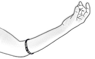
I was very impressed with the user study results. I thought they were very thorough in their testing. The fact that they tested the gestures for the conditions of holding a cup and carrying a bag answered a lot of questions about possibly functionality. I also liked the fact that they included a real world scenario in their experiment. The gesture set is not yet complete enough to be truly useful but it is encouraging that they are focusing on questions of actual usability. I was disappointed by the fact that they don't actually have an EMG arm band like the picture. Instead they used a series of electrodes and the participants had to remain seated next to a large EMG device. Although the technology they used is not at a real-world level, this paper answered a significant amount of important questions with a unique solution.

Intro Poster

My intro poster.


I couldn't resist adding some pictures of my cat, Holland. They were taken at the Houston Cat Show a few weekends ago. My wife and I dressed him up as a wizard for the costume contest. He was a very angry wizard, but still managed to win second place out of three.